Film Company Logos
Walt Disney Pictures:
The first Disney logo (1923-1937) represents the early days of the brand, featuring its first title character, none other than Mickey Mouse. He became the staple of friendliness, innovation and cheer, so the decision was logical for the brand. Mickey was certainly the focus of the design, and while there are other elements to the logo, Mickey steals the show.
The second (1937-1948) and third (1948-1972) versions of the logo were simply 'Walt Disney' in cursive handwriting of the founder
From 1972-1983, Disney decided to have 'better legibility'. Updating its logo by making the cursive font bolder and easier to read, while adding a sans font 'productions' underneath it. Keeping this idea for ages, they then decided (1983-1985) to swap the word 'productions' for 'pictures'
The castle appears in 1985 and stays the same until 2006. With new version entering in 2006-2011 and 2011 onwards. The castles design combines the theme of Disney castles with actual castles visitors can visit, ensuring a fresh and current look. The use of advanced technology in animated logo openings further enhances the brands appeal
We can also see the stages and development of colour and animations being brought into the logo between 1985 and 2011:
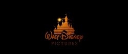
Finally from 2022 Disney brought in the special 100 year addition of the logo. There is a version with and without the slogan. In 2024 we were shown the most recent logo, which includes everything from the 2022 one, minus the 100 year words and slogans.
Universal Studios:

In 1914; the first logo was produced which showed a globe with rings surrounding it. This represented a planet much like Saturn.
In 1923 the studio was renamed to universal pictures, we see a spacey globe brought in, with the words surrounding it.
1927-1936 a more modern logo was created. This logo still featured many of the same concepts as the one in 1923. The words are now changed to 'A Universal Picture'.

In 1936, the words A Universal Picture was changed to around the globe. There is a colorised version of this logo, which can be seen on colourised prints of films originally produced in black and white.

In 1946, the studio was renamed Universal International until 1963. The logo created was more basic compared to the one prior, as it simply just showed the earth spinning with the words in front of it. However, its still featured the stars which were introduced in 1936.

1963 is when colour was introduced into their logo, which really helped to display the vivid blue earth. The earth continued to rotate, similar to the previous version, and the word 'Universal' fade into the logo.

In 1990, a more complex logo was produced, including many camera angles and zooms.

Following this in 1997, the logo was updated with more advanced CGI. It also had a new, majestic orchestral fanfare. It is one of the most recognisable logos and displays many details with a much cleaner look. The earth is illuminated with the word universal rotating around the globe, much like the logo in 1963

Finally in 2012, the most recent logo was produced, it shows how far technological developments have become. This logo is much like the 1997 one, just with greater detail and animation. It was created to celebrate the company's 100th anniversary, displaying these words below the title
Here is the basic developments in chronological order:
Paramount Pictures:
This logo has two emblems in it, thew mountain and the stars. The original meaning behind the 24 stars was for each one to represent a 'star' (actor) that signed with paramount in 1914. Apparently they were to add a star for each new talent that signed with them, however with the rapid growth of the movie industry, this would've been impossible. By adapting the logo, two of the stars have actually been dropped from the logo, leaving it with only 22 stars.
The first logo looked like this:

Between 1917-1935, the logo went through meany different variations, featuring the mountain, stars and clouds


In 1953, Jan Domela added more detail by giving the logo trees. This presented a more zoomed out look. And in 1968, the line 'A Gulf Western Company' was added underneath the word 'Paramount'. Surprisingly in 1975, the logo took a much more simplistic look in order to resemble the print version.


The studios 75th anniversary took place in 1986, therefore a new logo was established. Dario Campanile repainted the mountains and the original words from the last logo would fade in before the '75th Anniversary'

In 2002 the logo was given a CGI animated version to celebrate the company's 90th anniversary. A new design displayed shooting stars over a snowy mountain, being very romantic and dreamy.

The final 2 versions of the logo include the addition and subtraction of the by line 'A ViacomCBS Company'

The logos main adaptions appear like this:
Warner Brothers Pictures:
The Warner Bros. logo has always had basic structure: a shield floating in the clouds, stamped with the initials W.B.
The first Warner Bros. logo was created in the 1920s. This logo saw the studios initials in the lower third of the shield with the company's Burbank film studios
Throughout the 1920s and 1930s, the W.B. initials eventually grew to take over the rest of the shield.
In 1970, Kinney bought the company and changed the logo to something more simple. Which also sets the logo up for something that is most recognisable today.
Saul Bass was hired in 1972 to rebrand the logo. It then represented an abstract symbol, not resembling the original logo. This was very short lived as most films returned to the shield logo.
1984 they decided to go back to the shield with the background of clouds. The corporate names below the shield have changed throughout the years but it was been a shield ever since.

In 2019, to celebrate their anniversary, the company revisited the logo and rebranded from the classic gold writing. The new silver and white writing gives it a clean and crisp finish.
20th Century Fox:
William Fox began the fox film corporation in 1915. Then in 1935 the Fox Film Corporation merged with Twentieth Century Pictures which formed the company 20th Century Fox.
Before the merge in 1935, the 'film logo' was only read out the words 'William Fox Presents'. This was shortly changed to Fox Film Corporations presents.

Post the merge in 1935, the twentieth century fox logo was created by Emil Kosa Jr. The logo designed was a monolith with the companies name shaped into it. It also featured spotlights around it which would pan everywhere. This is the fundamental elements of the logo we can still see today.
1953 Rocky Longo repainted the logo in order to fit upon the widescreen cinematic format that was now being introduced into the world of film. For proportionality purposes, the zero was titled. However in 1981, the logo was revisited and the zero was placed back into its upright form.
In 1994, this logo was reimagined completely as the use of CGI animation was introduced. It started by sweeping from above the 20th sign and panning downwards to reveal the LA basin
In 2009, the logo was once again revisited and designed to make it look way more sleek and modern.
Finally in 2020, it was announced that the company would be rebranded to 20th Century Studios, so of course it was necessary to update the logo. Everything remained the same minus the fact that the word 'fox' was replaced with 'studios' and the textures were revised, giving the structure a more shiny look

Here is the rough outline of the logos evolution:
Scale Productions (our company):
Gino made our logo, and took it through a few different stages, talking it through with all of the team. However the final product is not what I personally envisioned for it.
The initial logo looked like this, and can be seen in our preliminary task one

I then suggested that we took more of a feel with the idea of 'scale' whether that be to do with measurement or snake scales. So we thought a snake eye would look good. Gino came up with the following logo, but we all decided it should look more like a snakes eye, to give it that context, or not have the eye at all.

Gino then went fully out of the box, attempting to lean toward a symbol of the snake, and made the background a jungle.

Following this, and heading back to the original idea, we looked at some smaller fog and changed the font.

Overall it was decided that to continue with the larger fog/smoke and read out the words SCALE PRODUCTIONS with the new font. Each letter in scale, stands for Sound, Camera, Action, Lighting and editing. My preference would have been to add in a feature that clearly portrayed our symbolism of scales (snake eye or physical scales) However the group decision was to go with the following logo


Comments
Post a Comment